7 Basic Elements of Good Website Design

Written by Jennifer Robinson
5 Minute Read

Table of Contents
When we talk about the creative and good website, there comes some basic principles to consider for all types of websites. Whether you create it yourself or hire a professional web design and development firm, there are some basic rules that you should follow to make your website look as good as possible. A good website design can help your business stand out amongst competitors and will help your business become more credible and attract more tech-savvy customers. Let's dive into the fundamental principles of creative website.
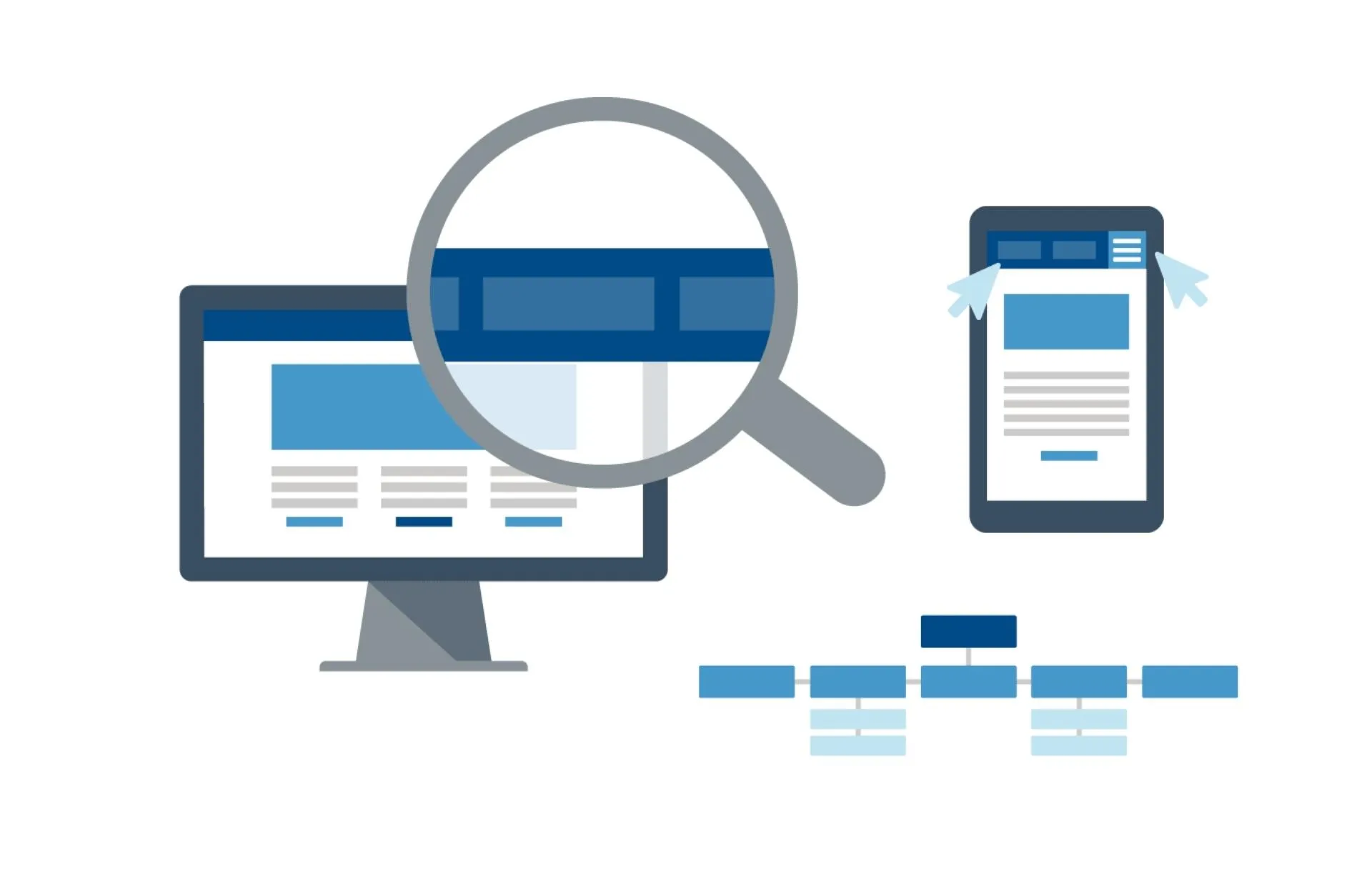
Easy to Navigate
A well-designed website must be easy to navigate by the users. Good website design has a navigation bar that is prominent and easily accessible. Typically, the navigation bar is at the top of a page, aligned to the left or right. The top of a page is the first place that visitors see when they arrive on a site. The navigation should always be easily accessible, especially for those who use screen readers. Good website design should ensure that the navigation bar is easy to find, accessible, and consistent throughout the website.
It is also important to focus on your product, rather than adding unnecessary elements. This is especially important for ecommerce website designers who must design that layout which has smooth navigation for the users. You can create a minimalistic layout with only images of products, leaving space for other items. You can also add social media sharing buttons for visitor’s convenience.
Appealing visuals
Good website design must include attractive visual elements that tell a story and keep visitors captivated with your website. The strong visuals can include the useful images, videos, descriptions, infographics, CTAs, and typography. The information displayed on a website should be valuable, and important links should be prioritized. In this case, the website design agency has the expertise in creating a multilingual website for cohesive experience. But make sure your website must not be overstuffed with the information as when you have too many options on the same page, your users will feel overwhelmed and leave without making a decision.
As Hick's Law states, “if there is too much variety, the more time people need to decide, the greater their chances are of choosing nothing.”
Responsive Website
If you're looking for a way to keep your website relevant to every type of device, you'll want to make sure it's responsive. Responsive design allows your website to adapt to all screen sizes without losing the look and feel of your website. For example, Dropbox has a website to work well on desktop and handheld devices. As you may have noticed that responsive sites also keep the signup form visible on desktop devices, but hides it behind a call-to-action button on mobile devices.
Dribble's website uses a flexible grid, which collapses into two columns on mobile. Responsive websites load quickly, easier to navigate on mobile devices and are also great for search engine rankings. Responsive websites are an excellent way to attract and keep customers. It also helps solidify your online presence, attract new customers and demonstrate trustworthiness to customers.

Colour Scheme
While using complementary colours in your design can help you achieve the desired effect. As complementary colours are number of colours that enhance look of each other. They can be used for navigation menus, text, button, and background. They can be used to increase the chances of clicks and conversion rate of your website.
In addition to driving conversions, the website design agency knows well that which colours combination can also strengthen a brand's image. For instance, people associate gold with McDonald's, which is why their famous arches are in gold. When choosing complementary colours, make sure to test them first to find the best combinations.
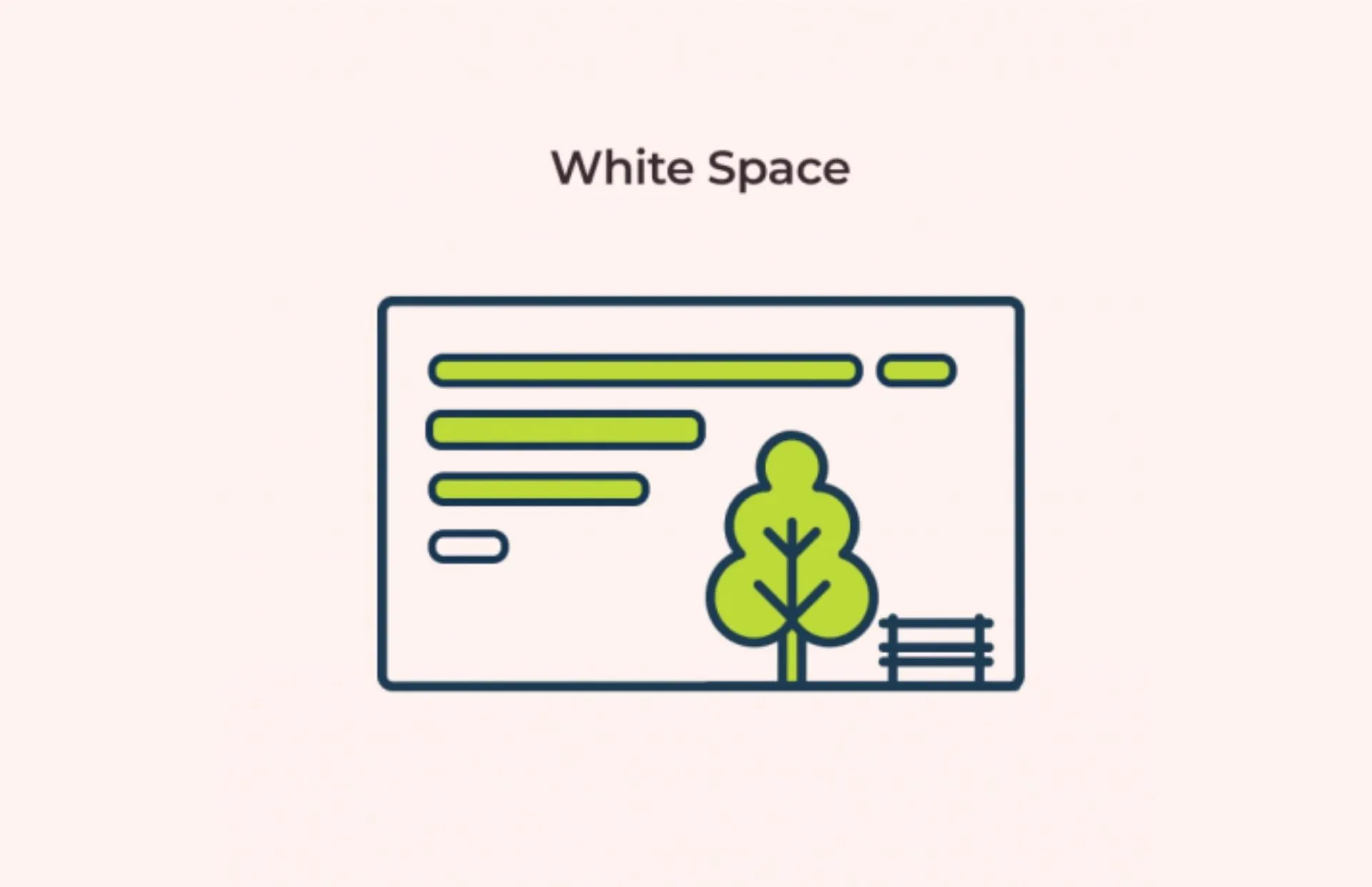
White space
Organizing your website by using white space is an effective way to make it easier for readers to find and understand the information you're trying to convey. White space is the blank space between the various elements on the website. It helps in making the flow of information and engage users to navigate through you site. When used correctly, white space can direct your audience's attention to important information, such as a call-to-action.
Whether you're building a blog or an e-commerce site, using white space is an important aspect of website design. For example, Woven Magazine's homepage uses white space to keep navigation clear and easy to read. While it's not the easiest to navigate, this website is an excellent example of how to use white space to attract visitors.
White space can also be used to separate elements in a design. Micro white space is a smaller space in between elements, while macro white space is the large space between major layout elements and content blocks.
Consistency
Another important aspect of an attractive website design is consistency. When your website is consistent in every aspect either it is about functionality or content, your customers will be more likely to trust you and return to your business again, as people are naturally attracted to beautiful things. Your website consistency shows your credibility, commitment and loyalty.
Your website design should also be consistent with your brand identity and advertising. The creative design agency can make it easier to change and update information to your website according to your requirements, that enable customers to find what they're looking for more easily. Being consistent in providing useful information, update with latest trends and serving user-friendly experience can give you new customers and retain the existing ones.
Simplicity
Good website design should have a simple layout. With simple but creative Ui UX design, the users can easily navigate through the site. This also reduces the number of choices available to the user. Having fewer options increases the user's likelihood of picking the most relevant option. Furthermore, the websites that are simple are more intuitive, which means fewer calls for support and instruction.
Simplicity is important in all areas of website design. A website that has a confusing layout or complicated scrolling can turn off users. Simplicity is a great way to increase conversions, and it is the core of any good website design. Simplicity also leads to hassle-free navigation of a website. Designing a simple menu makes easy for the visitors to navigate and find what they are interested in.

Final Thoughts!
As you have read that we have mentioned some of the fundamental principles of designing a creative and customizable website for every business need. Designing and developing a website requires a thorough understanding of the user's mind and the way they use technology. Cynosure Designs is providing an all-in-one platform to cater with all the demanding latest trends and techniques. Our professional resources have deep-down understanding and knowledge of the user's motivations and offering the simplest means to achieve those goals.
Originally Published November 3, 2022 11:12 AM, Updated November 3, 2022.
Our Latest Blogs


Our Clients


Our Clients


We are Google Partners
Being a Google Partner means we deliver excellent customer service, give customers a competitive edge and have been trained to help businesses grow online. We have Digital Marketing Specialists who know the google's algorithm better than any other experts in the field.
